
 Phase 2 · You do more than write now
Three ways to look at the same numbers
Pill 2.2 · Phase 2 · Prepare, analyse and turn billing data into criteria you can review.
Phase 2 · Pill 2 of 13 · Practice data, visible criteria

Read the full story · Clínica El Roble
The scene
The first Tuesday of the month, before opening. El Roble smells of coffee from the old coffee maker, and the light from Calle Olmos comes in sideways beneath the sign. Roble watches the two screens from the shelf with the indifference of someone who has seen it all, then lies down on top of the keyboard nobody uses.
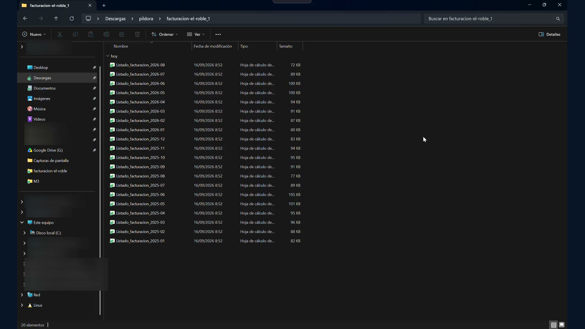
On one screen, the folder: twenty-one files sorted by date. On the other, the management dashboard: this month's revenue and the top ten clients. Pacheco has been at the top ever since Kaiser's treatment in May.
Marta does not want to know whether September was better than August. August is always quieter; the neighbourhood empties out. She wants to know something else, and it is an uncomfortable question because it contains an accusation: she raised her fees in February and does not know what has happened since then to the people who used to come in.
With Vital Pet six streets away, trusting her instinct is no longer enough. She wants to be able to prove that she is right. Or find out in time that she is not.
The nudge
She starts small, which is sensible. She uploads one file and asks a question. It works, and it works well. Encouraged, she goes for the whole year, and that is where everything comes to an abrupt halt: the files will not fit. Ten files, and that is it.
She brings it up in the morning huddle as her coffee goes cold, more to vent than anything else. And what always happens at El Roble when something is left half-done happens again: everyone in the room starts thinking aloud.
The everyday task
It is not this particular question. It is everything at El Roble that gets decided by feel because the relevant number lives in a folder nobody opens. Whether the Friday evening shift pays for itself or only seems to. Whether the March campaign achieved anything. Whether that February price rise was a good idea, and who has paid the price for it.
Some clinics have been getting things right by instinct for twenty years. And that works until it stops working, and you have no idea where it went wrong.
The breakthrough
Three routes came out of that coffee: the chat, a shared spreadsheet and a dashboard built on the clinic's computer. The same task in all three places. And the comparison is not about which one gives the prettiest answer, but what you have left in your hands when it finishes.
One. Before it calculates, make it declare. The first message does not ask for a single number. It asks the tool to tell you which columns it sees, how many rows it will discard and why, whether the amounts include VAT, which categories it counts as services and which as products (one by one), and whether, when it counts “clients”, it is counting clients or patients. Then it must stop and wait.
It is the step almost nobody takes, and the one that decides whether the number is worth anything. Watch what the tool does if you ask: it will tell you, without prompting, that the pet's name is repeated across different families and has to be cross-referenced with the client code. In other words, it knows. But it only says so if you make it say so.
Two. The figure is not the data. The data is what the figure is made of. How many people come in, how often each person comes and how much they spend. Three numbers that, multiplied together, produce the fourth. Ask for them in euros, not percentages: how many euros each one has added or taken away, with the correct sign. Percentages become unreadable as soon as one factor makes a large negative contribution. Anyone can understand euros.
Three. A client is not a patient. A client is the code, C0412. A patient is that code plus the animal's name. If you count only the name, fourteen families with a female dog called Luna become one. And if you then compare your visit frequency with the industry benchmark without spotting this, you think you are doing better than you are, because the industry counts patients.
Four. The criterion has to remain somewhere you can look at it again. In the chat, the declaration disappears upwards as you scroll, and tomorrow you start from scratch. In the spreadsheet, it is a tab nobody opens again. In the dashboard, it is a screen with drop-down menus that you can change to see what happens. A criterion you cannot see never quite becomes your own.
And the usual refrain: the tool builds the dashboard; you decide what counts as what, and what to do with what you see. But only if it gives you somewhere to record those decisions.
Before uploading anything: what stays at home
The report comes out of the software with twenty-one columns. Nobody needs three of them to understand how your clinic is doing: the client's name, tax ID and telephone number. Remove them. Keep the code, C0412, and keep the patient.
And here is what almost nobody checks: you do not lose a single metric. Unique clients, frequency, concentration, repeat visitors. All of that comes from the code. Anonymising costs nothing, so there is no excuse.
Now for the honest term, which we will say once and then move on. This is not anonymisation; it is pseudonymisation. If you can put the name back against C0412 — and you can, because it is in your system — it is still personal data. You have only removed what is visible at first glance.
At El Roble, five columns were removed: breed and the vet who signs the invoice went too. In a clinic with two vets, putting “Hugo” and “Marta” on every row does not add much and does make things slightly uncomfortable. A reasonable decision. And it has a price: forty minutes later, when the tool declares what it cannot calculate, there it is on the list — “revenue by professional, because the field is missing”. No AI will give it back to you. You deleted it. Which is precisely the lesson: what you can ask tomorrow depends on what you decided to keep today.
Doing it by hand means twenty-one files times five columns: an entire afternoon. In the video, the tool is asked to open all twenty-one files, delete those columns and leave the cleaned versions in a new folder without touching the originals. It took ten minutes — ten minutes when nobody needed to sit in front of it. Along the way, it noticed by itself that the column names in 2026 were different from those in 2025.
For the first time in this entire series, we are not asking it for an answer. We are asking it to do some work.
 13:59
13:59 43:31
43:31Route 1 · Marta and the chat
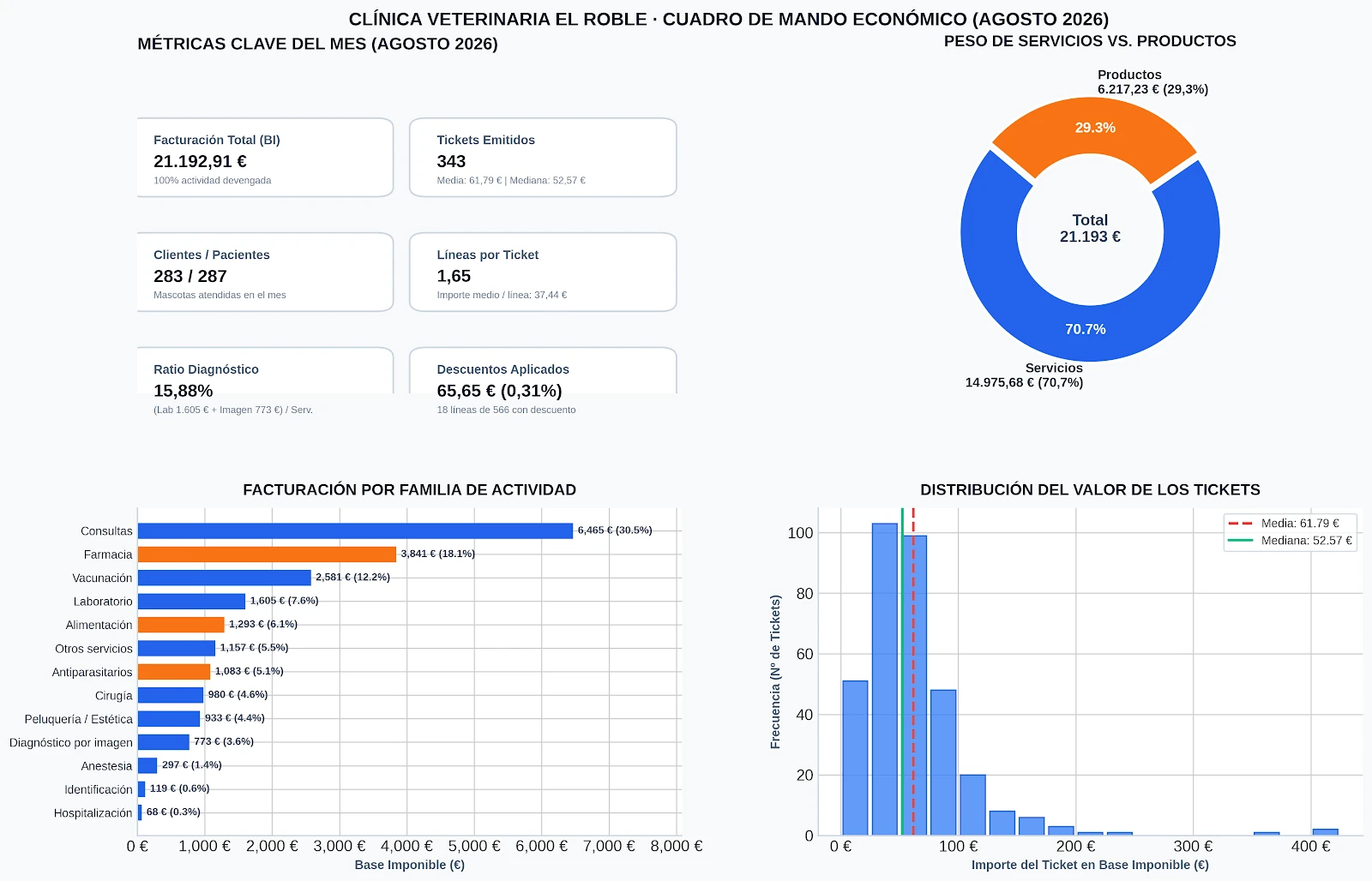
This is where it all began, on a Tuesday, with Marta on her own. With one month, it is impeccable: it declares the columns, discards the five letterhead rows, warns that there are 35 category labels written in different ways and suggests how to group them. Then it produces the August dashboard — 21.192,91 €, 343 transactions, an average transaction value of 61,79 €, a median of 52,57 €, 283 clients and 287 patients. Everything is exact.
The friction appears with the full year. It will not accept more than ten files at once, and when all ten are uploaded, it turns out that they have arrived “as empty references”, so it asks for everything to be consolidated into a single file. In other words, the very work you wanted to avoid.
With the complete history, it does remarkable things. Without any hint, it detects that prices were raised in February, and that a general consultation went from 31 to 33,80 €, an increase of 9 %. And it gets the comparison exactly right: +11.447,79 € cumulatively, 68 fewer transactions and an average transaction value 4,56 € higher.
And then it fails in two sentences. It says that 2025 closed at “almost 301.000 €” when its own table adds up to 296.024,80 €. And it says three times that there are no negative amounts, even though there are three credit notes. Credit notes which, incidentally, it did subtract correctly in the calculations.
This gives us a rule that applies to everything else: trust the table and distrust the headline. These are not two slips. They are two different engines working in the same response: one calculates, and gets it right; the other writes around it, and writing means choosing what sounds good.
What you have left: an answer. You look at it and that is that. Tomorrow, you start from scratch again.
Route 2 · Hugo and the spreadsheet
Hugo does not need to be asked twice. That same afternoon, he already has all twenty-one months pasted into a spreadsheet in the clinic's Drive, one per tab, with the tool working inside the document. He did not ask it for a summary: he asked it for tabs. And it created them. CRITERIA, with every decision recorded in writing. DATA, with all fifteen thousand rows normalised into a single table. And DASHBOARD, with formulas that recalculate automatically. It finds the three credit notes. And on a second pass, it adds a period selector and six charts.
Hugo is pleased, and rightly so: this works, and anyone who stops here already has a dashboard for the year. He calls Marta over to show her.
Marta looks at the screen for thirty seconds and points to a column.
—Hugo. Unique patients: thirty-three.
—Yes, in every month. Strange, isn't it?
—I see thirty-three patients in three days.
It was counting pet names. Thirty-three different names across two years of clinic data, because the Lunas and Thores from fourteen different families had been merged into one. Hugo asks it to fix the problem, and this is where it gets interesting: the tool fixes the new card and leaves the old column unchanged. The spreadsheet ends up with three definitions of patient coexisting on the same tab —33, 679 and 1.083—, all three with the same label.
What gives Marta pause is not the error. It is that the very same tool, in the morning's chat, had warned them without prompting that the code and name had to be cross-referenced. Knowing something and doing it are not the same thing.
And there is a second hidden cost, a quieter one: outside Google, the spreadsheet breaks. Ninety-one of its formulas only exist there. If you download it to Excel, you take away frozen numbers and lose the mechanism.
What you have left: a spreadsheet. Change a value and the dashboard notices. Next month, someone has to work on it again. Not much, but somebody has to remember and know where to make the change.

Route 3 · Diego and the dashboard
Diego has stayed quiet throughout the conversation, as usual. When Hugo closes his laptop, he says:
—There is a way to get what you want — to make it update itself.
—And how do you know that?
—I'm taking a course. Tuesdays and Thursdays, after I finish work.
He has been doing it for two months. He had not mentioned it.
Diego's dashboard reads a folder on the computer and stores the finished result locally. He uses an AI-assisted tool to build it, so it must not be assumed that the entire process takes place on the machine: the service configuration and terms need to be checked. With one short sentence —“I want a financial dashboard that opens in a browser and lives on my computer, not on the internet”— it produces a polished-looking website. Polished-looking, but with two errors, which is what happens when the brief is too short: it was using the total including VAT as revenue, and its own filter was swallowing a credit note with unusual numbering.
So Marta sits down and dictates the entire brief. Where the data comes from. How it should be stored so that nothing has to be rebuilt next month. What a client is and what a patient is, after what happened that afternoon. A criteria screen that can be edited. The order in which she wants to read the information. And the rules.
With that, the complete dashboard is accurate: all twenty-one months, the 2025 total, the three credit notes, the 360 subtotal rows discarded, the median, the concentration and the outstanding debt by age. And it does three things that are always worth asking for:
- It identifies each file by its contents, not its name. Rename a file that has already been imported and it does not count it twice.
- It declares what it cannot calculate and why: genuinely new clients (there is no registration date), margin (there are no costs), actual payment time (there is no payment date). And it leaves those metrics out instead of estimating them.
- It keeps the checks visible: how many rows there are, how many imports there have been and how many rows it discarded.
Diego brought the tool. Marta wrote the brief. And that is, more or less, the whole pill.
What you have left: a dashboard. Next month, all you have to do is drop a file into the folder.
The same metric, six different numbers
This is the heart of it, and we did not manufacture it. It emerged on its own.
The diagnostic ratio measures the share of laboratory and imaging revenue within your service revenue, and it is one of the metrics that says the most about how you work. With the same files, the same question and the same formula:
| Where | What it included under “services” | Ratio |
|---|---|---|
| The chat, using August | + grooming + other | 15,88 % |
| The chat, using the full history | same | ~17 % |
| Hugo's spreadsheet | its own criterion | 17,14 % |
| The dashboard, parasite treatment as a service | + parasite treatment | 16,7 % |
| The dashboard, default criterion | grooming yes, parasite treatment no | 18,0 % |
| The dashboard, grooming as a product | neither | 19,2 % |
None of them has made a mistake. All six calculations are correct. What changes is what each one decided counted as a service, and nobody showed you that decision.
Notice, too, that the direction is the opposite of what you might expect: when you put more categories under “services”, the ratio goes down. Laboratory and imaging remain the same 27.623 €, so the numerator does not change; it is the denominator that grows. Being generous with yourself when classifying makes your metric worse.
And here is the useful part: the industry benchmark is 20–25 %, and El Roble is below it in all six readings. So moving the drop-down does not change the decision; it changes the number. First set the definition and then look at the figure, never the other way round. Because if you choose the definition after looking at the number, you are no longer measuring. You are negotiating with yourself.
The adjustment belongs to Marta
The dashboard shows revenue in green, +5,6 %. And that is precisely when you need to stop, because it is green.
| Lever | 2025 → 2026 | In euros |
|---|---|---|
| Active patients | 1.022 → 1.083 | +13.274 € |
| Frequency (transactions per patient) | 3,79 → 3,50 | −18.184 € |
| Average amount per transaction | 57,45 € → 61,98 € | +17.401 € |
| Total change | +12.491 € |
The easy reading is “growth comes from price”. That is what the chat says, and it falls short. Look at the middle two figures: −18.184 and +17.401 almost cancel each other out, leaving a difference of 783 €. In other words, the entire February increase has gone into offsetting the fact that people come in less often. What has made El Roble grow is new patients, and little else.
And that changes what needs to be done. If the reading were “growth comes from price”, the next step would be to review fees. Because the true reading is “growth comes from acquisition”, something else is urgent: finding out why existing patients are coming less often. Because the day fewer new patients come through the door, that +5,6 % will collapse on its own.
Before trusting it, Marta checks one more thing: whether the average transaction value is rising because more is done at each visit or because the same visit costs more. Lines per transaction, 1,73 → 1,71. Amount per line, 33,18 € → 36,33 €. The clinic is not doing more. It is charging more.
And right at the bottom is a number she was not expecting: 16.586 € outstanding, with eight out of ten euros more than ninety days overdue. A dashboard will not fix that. That calls for a conversation with Sara, on another day.
So she decides on three things. She removes six metrics from the dashboard, because twelve numbers nobody looks at are worse than four that everyone checks every month. She moves the comparison with the previous year and the breakdown in euros to the top. And she writes down two tasks: find out why frequency is falling and diagnostics: review in January.
That evening, at home, Carlos asks the only question that turns data into a decision:
—And what are you going to do about it?
Do it yourself in 4 steps
- Clean before uploading. Remove the client's name, tax ID and telephone number. Keep the code and the patient. If you plan to remove anything else, such as breed or professional, make a considered decision: what you delete today is a question you will not be able to ask tomorrow. If there are many files, ask the tool to process them as a batch and place the cleaned files in a new folder without touching the originals.
- Choose where to work, knowing what you will have left. In the chat, an answer. In a spreadsheet, a spreadsheet that recalculates. In a dashboard on your computer, a dashboard you can return to. The question is not which is better; it is what you will need next month.
- Make it declare before it calculates. Paste in the brief, read the declaration and correct it if necessary. This is where everything is decided.
- Read the three levers in euros and make one decision. Just one. If no decision comes out of a dashboard, all you get from it is decoration.
Marta's tip: when it gives you the result, take the table and add up the column yourself. If the total in the text does not match its own table, you already know which one is telling you a story. And always check one figure you know by heart: if something feels wrong, pay attention.
Resources for repeating the exercise
Two supporting references and the twenty-one original Excel files from the fictional El Roble case.
Sector reference for checking indicators without comparing figures out of context.
PDF · 4.1 MB · Spanish
Definitions, criteria and guidance for reading the dashboard built in the videos.
PDF · 188 KB · Spanish
Original exercise files. The case is fictional; always work on a copy and preserve the originals.
ZIP · 21 XLSX · 1.8 MB
The prompt · copy it
The brief is the same in all three places. Only the final section changes: the part that says where the data is and what shape you want the result to take. And that is today's prompting lesson: a good brief has one part that travels and another that adapts.
1) The core (identical in all three routes):
ROLE AND CONTEXT
You are a management analyst for a small neighbourhood veterinary clinic with two
vets. You work for the owner, who is not an economist and has very little time.

WHAT I AM GIVING YOU
Monthly billing exports from the practice management system. One row per invoice
line. Several months from two different years. The files are not clean: they
contain letterhead rows before the header, daily subtotal rows that are NOT sales,
amounts and dates stored as text in some months, category names written in several
ways, and from January onwards the system changed the name of some columns and
added a new one.

DECLARE BEFORE CALCULATING ANYTHING
1. Which columns you see and what you understand each one to mean.
2. How many rows there are, how many you will discard and why.
3. Whether the amounts are net of VAT, include VAT, or contain both.
4. Which categories you count as SERVICES and which as PRODUCTS, one by one.
5. When counting “clients”, whether you count clients or patients, and which field
   you use to identify them.
Stop and wait for my confirmation. Do not calculate anything yet.

RULES
- Always use NET AMOUNTS, never the total including VAT.
- Group categories whose names are written in different ways.
- Credit notes (negative amounts) must subtract from the total; tell me how many
  there are and which months they come from.
- Exclude rows that are not invoice lines.
- CLIENT = client code. PATIENT = client code + patient name. Never count only the
  animal's name. Use the same definition throughout the dashboard.
- If these data do not allow you to calculate something, SAY SO and leave it out.
  Do not estimate it. Do not invent industry benchmarks.

THE DASHBOARD, in this reading order
1. Revenue for the period (net of VAT), compared with the same period in the
   previous year, the year-to-date total and the average for the last twelve months.
2. The three levers: active patients, transactions per patient and average amount
   per transaction, each with its change.
3. Breakdown of growth IN EUROS: how many euros each lever adds or subtracts, with
   the correct sign, and make sure their sum matches the total change.
4. Price or mix? Lines per transaction and average amount per line for both periods.
5. Average and MEDIAN transaction value, together.
6. Breakdown by category, percentage of services and diagnostic ratio
   = (laboratory + imaging) / service revenue x 100.
7. Active clients and patients over the last 12 months, and revenue from the top
   20 % of clients.
8. Discounts and outstanding balances by age from the invoice date.
2) The final section, depending on where you work:
· IN THE CHAT
I have attached the files. Return the dashboard as text and tables that I can copy,
plus one chart. Also tell me how many files you can accept at once.
· INSIDE YOUR SPREADSHEET
The files are in this spreadsheet, one per tab. Use it directly. I do not want a
summary in the chat: I want new tabs. Create CRITERIA (write down everything you
have decided there before doing anything else), DATA (a single table containing
all the real rows, with amounts and dates properly converted) and DASHBOARD (with
formulas that recalculate when I add rows to DATA; no manually pasted values).
Add a period selector at the top: month, quarter, full year, year to date and custom
range. If the previous period does not exist, write “not comparable”, not zero.· IN A DASHBOARD ON YOUR COMPUTER
The files are in this folder on my computer. I want a dashboard that opens in the
browser and lives here, not on the internet.
Store the data in the dashboard itself: when I place a new file in the folder, add
its records to the existing ones and do not rebuild anything from scratch. Identify
each file by its CONTENTS, not its name: if I rename a file that has already been
imported, do not count it twice.
I want a visible, editable criteria screen: a list of categories, each with a
Service / Product drop-down, and when I change one, show me the percentage of
services and the diagnostic ratio before and after.
Each card must stand on its own: if a value is missing, that card shows a dash and
the rest of the dashboard remains visible. And always show the number of rows and
imports in the footer.Take it one step further
- Ask for the drop-down even if you do not plan to touch it. Being able to move “parasite treatment” from product to service and see the ratio change on screen is what turns a number into your own decision. And it shows you in a second how much of that number came from a criterion and how much came from reality.
- Keep the declaration. Copy it into a dated document. Six months from now, when you compare results, you will need to know what you counted as what. That is the difference between having a history and having two snapshots that do not match.
Before → Now
Before. Never. Not three days or one week: never. Two years of the clinic, month by month, in a folder that was opened only to empty it.
Now. An afternoon the first time, because setting clear criteria takes time and that time is valuable. From then on, ten minutes: place the month's file in the folder and look at four figures. What you recover is not minutes. It is a question that had stopped being asked.

What it costs
A clinic already pays for practice management software, a payment gateway, accounting, telephone service, reagents and insurance. This is one more line on that list.
These are two different subscriptions. These are the base prices published by the providers and checked in September 2026; they may change and exclude applicable taxes:
- Google Workspace Business Standard, which includes Gemini in Docs, Sheets and other applications: USD 14 per user per month with an annual commitment, before tax. Flexible billing has a different price.
- ChatGPT Plus, as a reference paid individual plan: USD 20 per month, before applicable taxes. Availability of the features shown may vary by account and rollout; API usage is billed separately.
They do not do the same thing. One lets you keep the analysis live inside a spreadsheet your team already shares; the other is used to build the dashboard shown in the exercise. You can have one, and you can have both if you will make good use of them, because each brings something different. Always check the final price and regional terms before subscribing.
What we are not going to do is convert that cost into transactions. A transaction is revenue, not what you keep: behind it are products, consultation time and staff. That calculation looks very neat and means nothing.
The honest calculation is different. One afternoon the first time, then an up-to-date clinic in ten minutes, this month and next. The question is not how much it costs. It is how many decisions you made by guesswork last year because that number lived in a folder you opened only to empty it.
ChatGPT Plus is billed monthly. Google Workspace offers both annual-commitment and flexible billing; if you need to cancel the following month, choose the flexible option and check its terms. The exported dashboard needs no dedicated migration or installer, but the subscription and data processing depend on the service used to create and maintain it.
Before you begin
- Always clean the file before uploading it if it leaves your computer. Remove the name, tax ID and telephone number. You do not lose a single metric. And remember that this is pseudonymisation, not anonymisation: as long as you can put the name back, it remains personal data.
- Check where your data ends up. In a web chat, it is uploaded to the cloud. In a work spreadsheet, it remains in the clinic's account, which the whole team can access, so take care with what you put there if you share an account. A dashboard may store and run the finished result on your computer, but that does not prove its creation or maintenance is entirely local: check the architecture, configuration and provider terms.
- The tool calculates; you classify. What is a service and what is a product, what counts as a patient, which period you compare. If you do not decide, the machine has applied a default and has not told you.
- Trust the table and distrust the headline. The numbers in tables and charts are usually correct. The prose around them is written, not calculated.
- This is management analysis, not clinical-record analysis. Anything involving clinical decisions belongs to a different category of tool and a different conversation.
- All three routes shown use paid services and require an internet connection during AI-assisted construction or analysis. Once exported, a local dashboard may work offline if its architecture allows it; verify this before entering sensitive data.